
Barton springs nursery
Role: Sole UX Designer and Researcher
Time: 2-week sprint
SUB-TITLE GOES HERE….
Project context
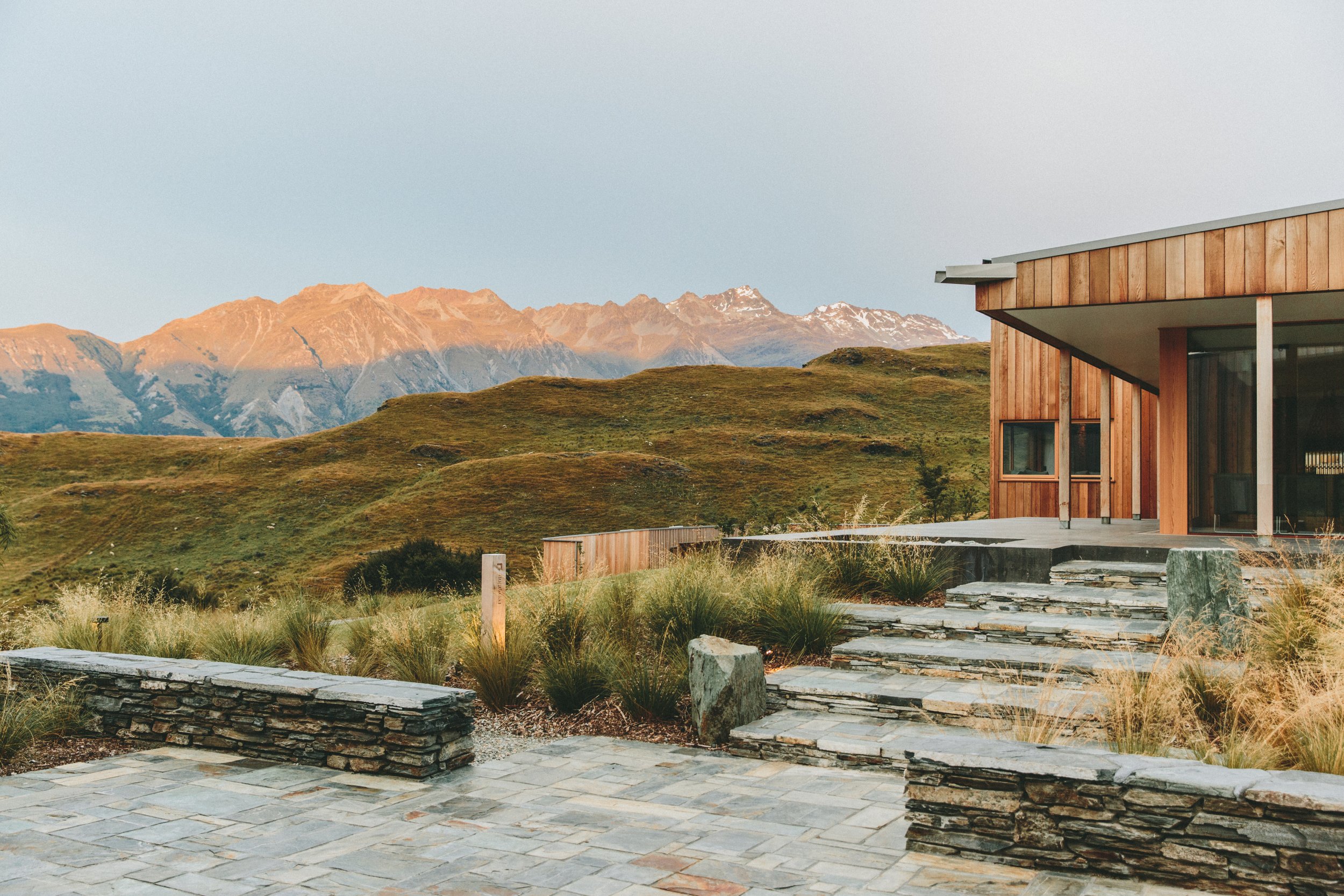
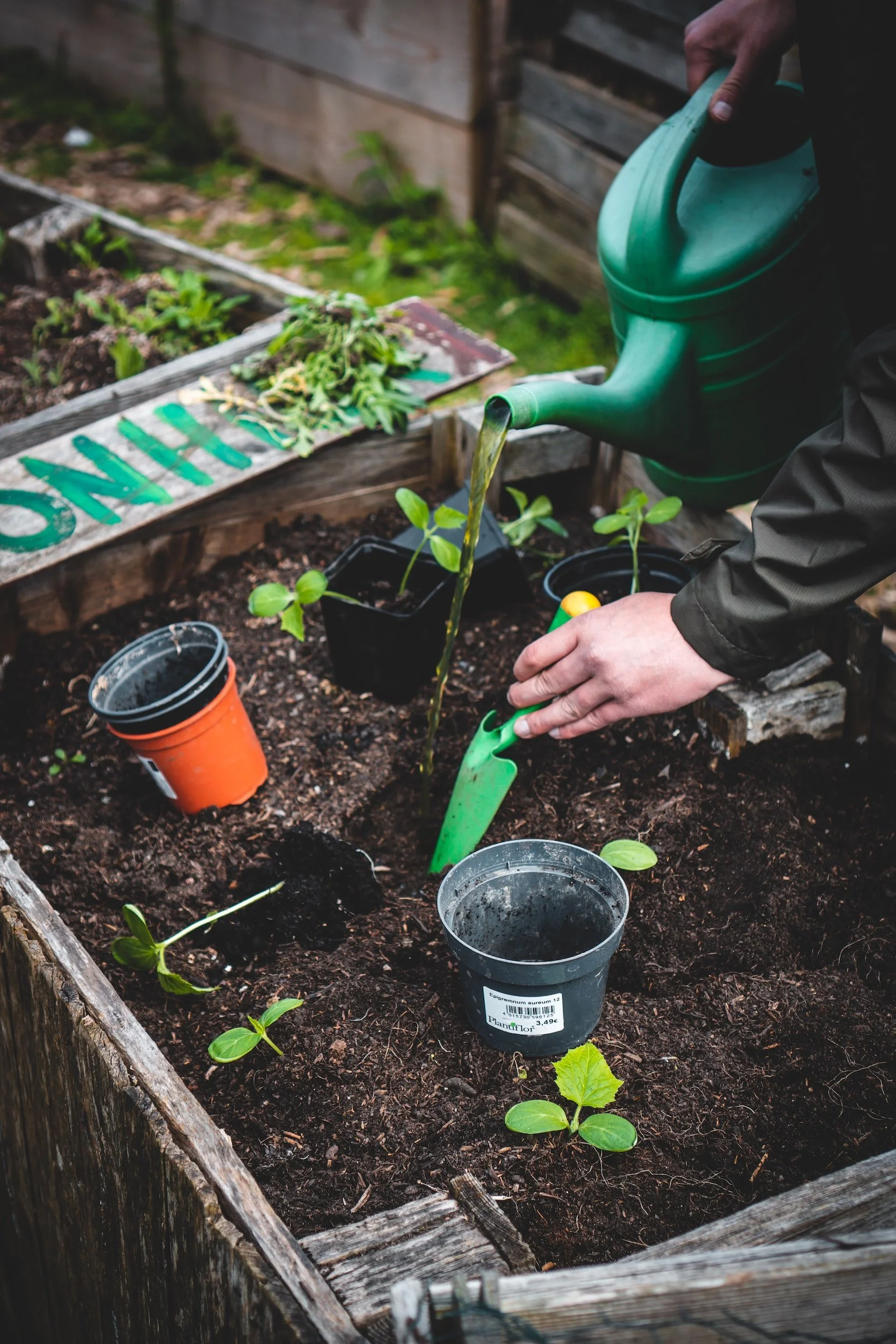
Barton Springs Nursery (BSN) is a local Austin plant nursery
research & findings
Sub-title goes here
I I wanted to understand more about the users that would frequent BSN and and how they would best benefit from its new update and addition of e-commerce functionality.
I identified target users here as those who shop online as well as shop for plants for their home, either in-person or online.
User Interviews
My goals for user interviews were to understand:
Users’ goals and pain points when shopping online

Users’ goals and pain points when purchasing plants

Users’ experience with purchasing plants online

Analyzing the interview data via affinity mapping yielded a few trends:
Users buy plants primarily based on need (pet-friendly, low-light, etc.), and secondarily on aesthetics

Users didn’t consider themselves plant experts (as also verified through card sorting below)
Users researched a lot before making any purchases online - they wanted to trust businesses

Users exclusively preferred to buy plants in-person and distrusted purchasing them online

Learning this information helped me realize that building trust with users and recreating the in-person plant store experience as best possible online would be the top priority in my design, especially if I wanted users to use the new e-commerce function.
Competitive & Comparative Analysis
I also wanted to see what competitors in the online plant market, as well as brands with a strong e-commerce presence in general were offering - how they handled things like navigation, search, product description pages, and the checkout process.
Takeaways from my analysis of 6 companies showed:
Navigation: all competitors kept product categories for plants simple (e.g., simply just “Plants”), with sub-sections for plants based on different needs.

Search: searching for items through the the search bar and secondary navigation bars showed that most competitors didn’t really use scientific or proper plant names. This aligned with our research findings that most users don’t consider themselves to be plant experts. The ability to filter by price, other qualities was also important.


Product Descriptions: individual product pages all generally included recommendations for similar items. Opportunities of features to include: better images especially for showing scale of plants, shipping details, customer service access, quality guarantees, and reviews - given that users told us they don’t trust buying plants online
Checkout Process: most competitors offered the option to checkout as a guest or create an acccount
These findings helped articulate the standard features the new BSN website design should include, as well as opportunities for BSN to set themselves apart.
Card Sorting
I also ran Card Sorting exercises to see how users would naturally categorize and group items from BSN (based on an image and the name of the item), and thus which product categories might make the most sense for those interacting with the new website.
This analysis from Optimal Workshop shows that if we keep the number of categories low (3) for simplicity’s sake, users frequently categorized items into distinct categories such as:
Plants (purple)
Pots and planters (orange)
Indoor decor (green)
Users categorized plans in many different ways - by plant size, indoor/outdoor, flowering, etc. Knowing this in conjunction with the fact that users didn’t consider themselves to be plant experts, plus what I saw in the C&C analysis, I planned to keep the plants section on the website broad, and allow for lots of filtering options to fit users’ needs.
Design & Iteration
Sub-title goes here